PS. This image is scaled down. The original is of course a high resolution 300 dpi file.

Thanks, for the feedback! I´ve also been thinking of removing some of the "noise".tautologies wrote:Nice. Good effort getting feedback. I think you could make your message a little clearer. There is a lot of noise on the poster, which takes away from the message.
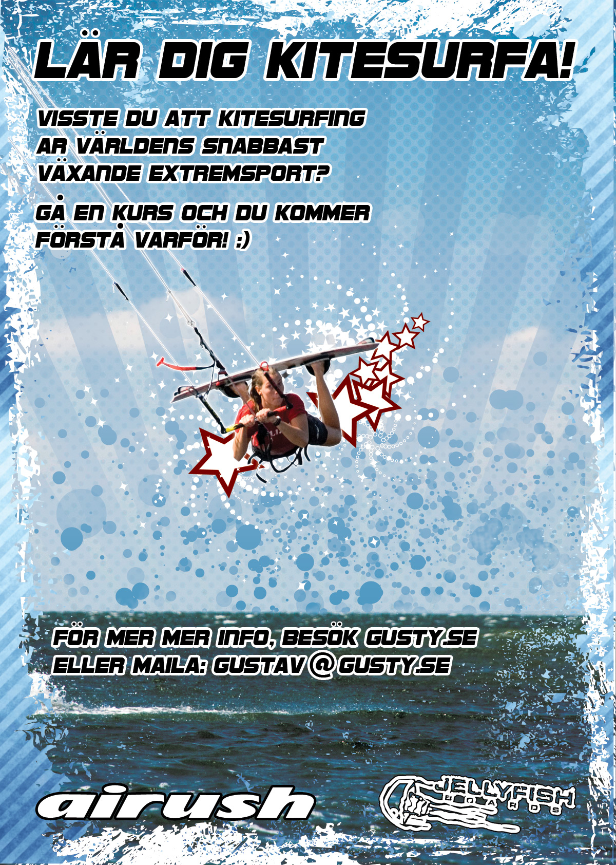
First eye catch: Good image.
Next contact you. That part I think has to be clearer and easier for people to get. There is no direct link between the header and you.
I would have the headline Laer dig (at) kitesurfa med then your email.
I would also probably tone down the noise a little.

I agree with 20% larger but the spirals and the stars are too much for me. Also, maybe choose a shot when she is smiling if you have one. Nice to see a young woman ripping it. Catches the eye! Use it!DrLightWind wrote:Excellent and coherent creation
The girl with the board could 20% larger to enhance,
with the white spirals extending to edge of the water
DrLW

Users browsing this forum: Bing [Bot], blu, Google [Bot] and 287 guests